.png)

From Hesitation to Confidence: Improving the Tenant Invitation Flow
Role: Product Designer
Team: Senior Design Manager, Front End Developer
Tools: Figma, Pendo
Timeline: 40 hours
Process: Research, design, ideation, prototyping, testing
Overview
I redesigned the tenant invitation flow to remove uncertainty and increased tenant invites by 12.7%.
Landlords hesitated to invite tenants due to uncertainty about the tenant experience. Data showed a 26% drop off at the "Add Tenant" step, with many landlords signing up as tenants just to preview the invite email. The outdated preview link and unclear CTA caused unnecessary friction.We streamlined the process, providing landlords with a clearer, more intuitive way to understand the tenant journey—ultimately increasing confidence and reducing hesitation in sending invites, resulting in a 12.7% increase in renter invites.
What Is Azibo?
Azibo is a property rental SaaS platform that simplifies every aspect of property management—from rent collection and tenant screening to accounting and lease generation. At Azibo, we take the stress out of managing properties by providing powerful tools within an intuitive and seamless platform. By eliminating the guesswork around the tenant invite and experience, we created a simple, transparent way for landlords to preview the process—helping them confidently invite renters without hesitation.
The all-in-one rental management platform built for landlords.
Who We Are Solving For
Landlords manage everything—rent, leases, accounting, and maintenance—often on their own. With so much to juggle, they need tools that simplify their workflow, not add confusion. But when it came to inviting tenants, uncertainty held them back. Many hesitated, unsure of what their renters would see, and some even signed up as tenants themselves just to preview the process. They needed a clear, seamless way to understand the tenant experience—so they could invite renters with confidence and keep their properties running smoothly.
Landlords need a seamless way to manage their properties—without the guesswork.
The Problem
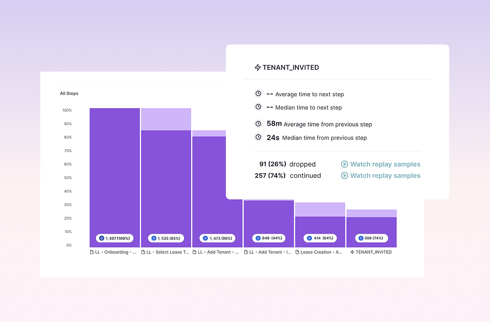
A 34% drop-off in tenant invites revealed a major friction point.
I set out to find ways to increase renter sign-ups and make the onboarding process smoother for landlords. By analyzing over a 100 user sessions in Pendo, we discovered a major friction point—34% of landlords dropped off when adding a tenant for rent collection. Digging deeper, we found that many were signing up as tenants themselves, trying to understand what their renters would see. The existing invite preview was outdated and unclear, leaving landlords hesitant to send invitations. This uncertainty slowed down the process and reduced tenant adoption. Landlords needed a clear, easy way to experience the tenant journey upfront, so they could confidently invite renters and streamline their workflow.
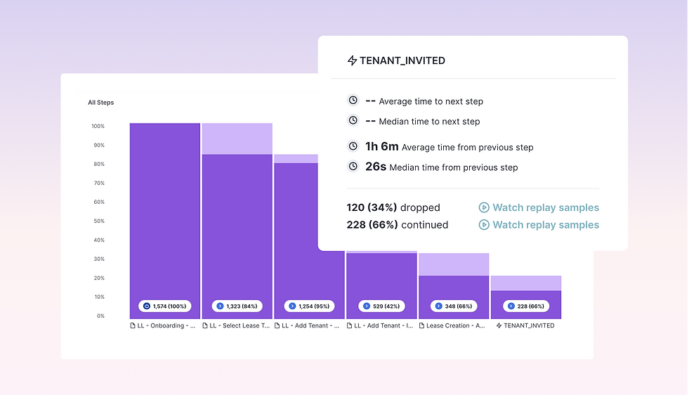
34%Drop off 😫
The Process
Refining the experience through iteration to drive landlord confidence.
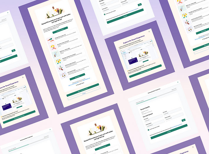
From the start, I explored different ways to present the tenant experience while ensuring landlords stayed focused on inviting renters. The challenge was to balance clarity and usability—providing enough information to build confidence without overwhelming or distracting landlords from the primary action.
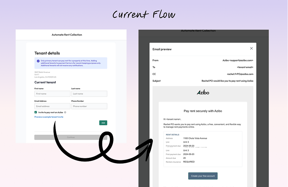
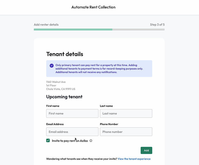
The Current Flow
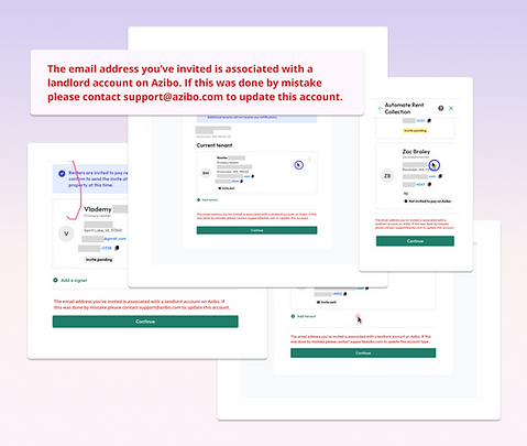
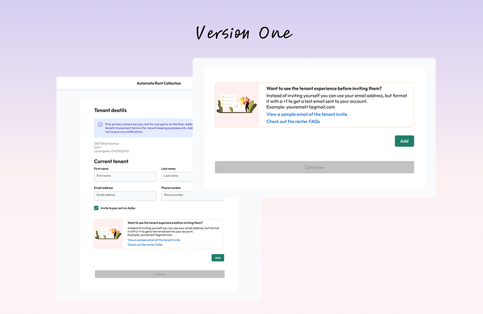
The original flow had a CTA link that was unclear, leading to hesitation and confusion among landlords. The modal itself was outdated and lacked value, providing no meaningful insights into the tenant experience. As a result, landlords weren’t confident in sending invites, and many signed up as tenants themselves just to preview the process. This highlighted the need for a more informative, engaging, and frictionless solution.
Adding an informational card above the CTA
My first attempt introduced a card above the CTA to provide more context on the tenant experience, including how landlords could test the invite process themselves. While informative, it distracted from the primary action of adding a tenant. This reinforced a key realization: even in the original flow, placing the link above the CTA was causing hesitation. Instead of guiding landlords smoothly, it diverted attention and slowed down the process.
What I learned:
-
The additional information was helpful but distracted landlords who weren’t actively curious about the tenant experience.
-
It made the main CTA (adding a tenant) less prominent, slowing down the flow.
-
I needed to find a way to provide information without interfering with the landlord’s primary goal.
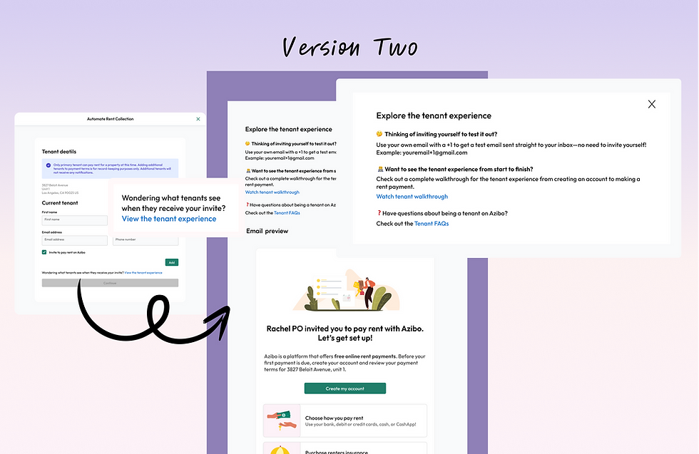
Moving the experience to a modal
To prevent distraction on the main page, I shifted the experience to a modal, updated the email preview, and improved the link copy to better convey its purpose. This version consolidated the information in a dedicated space, keeping the primary action separate. However, while this approach cleaned up the UI, it still had its own issues—it was too text-heavy and underwhelming.
What I learned:
-
Moving to a modal helped declutter the main tenant invite flow.
-
However, the over-reliance on text made the experience feel dull and unengaging.
-
Landlords still hesitated to take action because, although the email preview was visible, the preceding text created distraction rather than guiding them toward the invite process
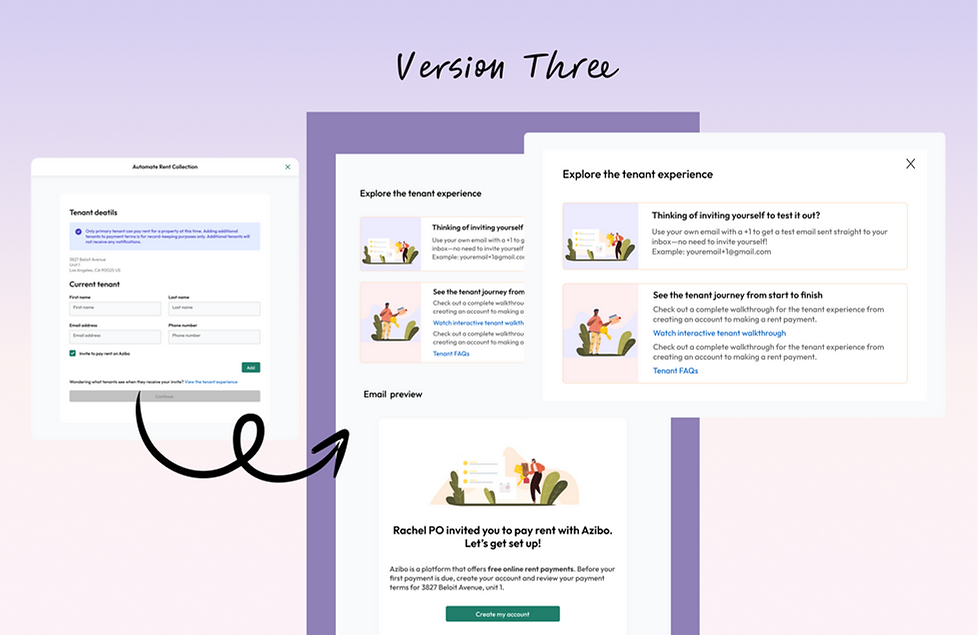
Improving visual hierarchy and engagement
To prevent distraction on the main page, we shifted the experience to a modal that opened from the link, updated the email preview to reflect the most current version of the tenant invite, and improved the link copy to better convey its purpose. This version consolidated the information in a dedicated space, keeping the primary action separate. However, while this approach cleaned up the UI, it still had its own issues—it was too text-heavy and underwhelming.
What I learned:
-
The additional information was helpful but distracted landlords who weren’t actively curious about the tenant experience.
-
It made the main CTA (adding a tenant) less prominent, slowing down the flow.
-
We needed to find a way to provide information without interfering with the landlord’s primary goal.
The Final Version
After multiple iterations I realized that I needed a clear, interactive experience that fit seamlessly into the invite flow. Instead of relying on external links, I introduced a Pendo-powered walkthrough, letting landlords preview the tenant journey firsthand. I streamlined the experience by embedding a step-by-step preview, refining link copy and visual hierarchy, and ensuring landlords had the right information without distractions.
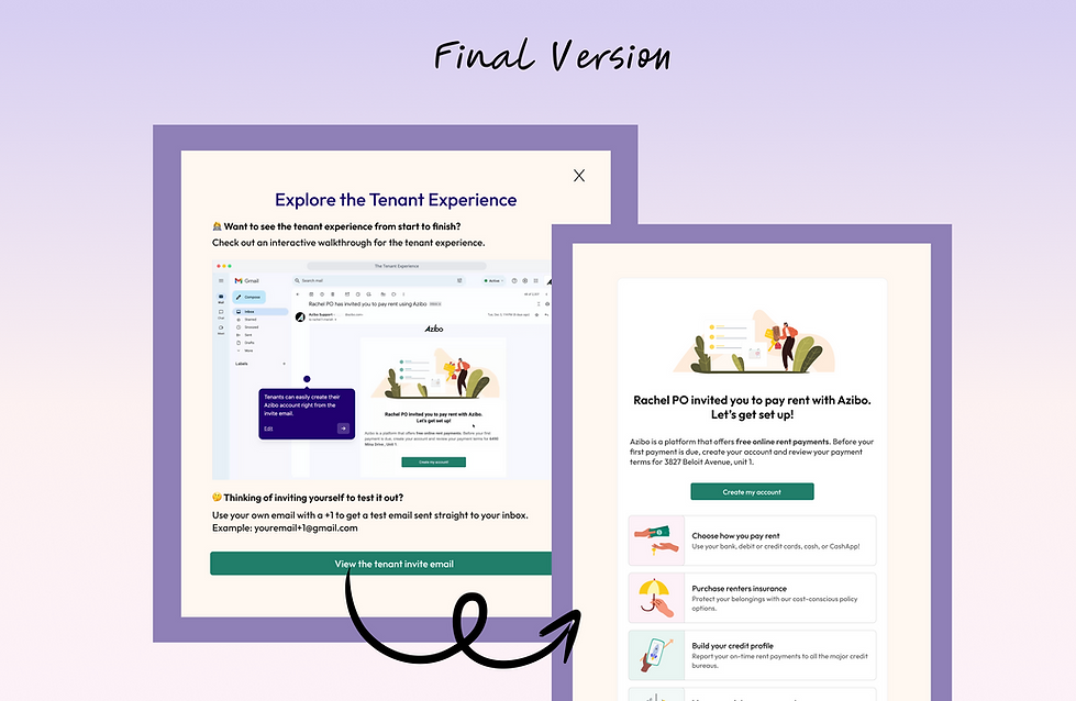

Results
After implementing the final version into the in app Pendo guide, I was able to conclude after 30 days that tenant invites increased by 12.7% resulting in an additional 29 renters invited.
12.7% increase 🎉
Reflections
What I Learned:
-
Keeping the user within the app is pivotal for users to complete the flow
-
Prioritized clarity and usability, ensuring that the invite process remained the primary action, with additional context only for those who sought it
Next Steps:
-
Dive into other steps in the flow and see where other drop offs are
-
Continue to monitor Pendo playbacks to see why users continue to drop off when inviting a tenant
-
Utilize the metrics from the in app Pendo guide to gather more insight on user interaction to improve the flow